Or: Why QR Codes Became the Pigeons of Modern Cities — And How Visual QR Codes Change Everything
QR codes used to feel clever. Novel. Even a bit futuristic.
Now? They’re pigeons.
Not hated. Not loved. Just… everywhere.
So everywhere, in fact, that we barely see them anymore.
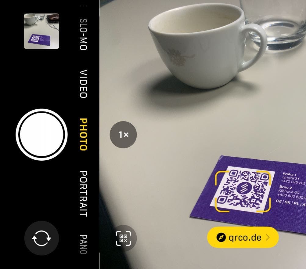
The other day, I sat in a café and spotted five QR codes within one meter of my coffee cup. One on the menu, one on the table, one on a flyer, one on a loyalty card – and one stuck on the window telling me to “Scan for newsletter.”
That’s when it hit me:
QR codes didn’t fail. Our attention did.
They turned into background noise – part of the visual clutter we’ve trained ourselves to ignore.
1. Why we don’t see QR codes anymore
There’s a simple psychological reason:
when our brains see the same visual pattern over and over, we stop noticing it.
UX and behavioral psychology folks call this habituation or banner blindness.
Everyone else just calls it:
“Honestly, I didn’t even notice that QR code was there.”
A plain black-and-white square doesn’t spark curiosity. It doesn’t promise anything fun or valuable. It doesn’t feel trustworthy. It just sits there, quietly competing with:
- coffee cups
- people
- lights
- posters
- phone screens
…and losing every single time.
2. Everyday situations where QR codes quietly fail
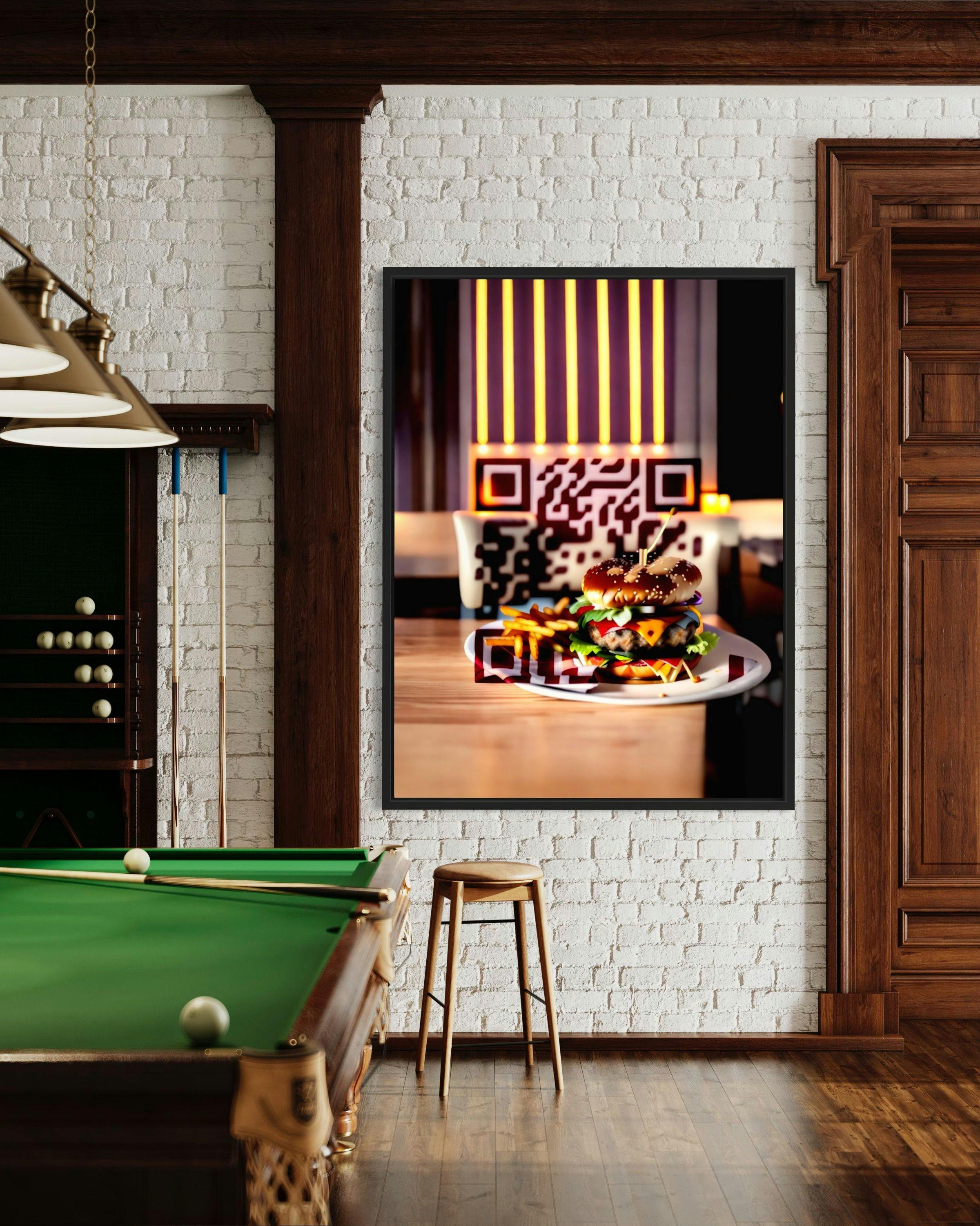
☕ Cafés & restaurants
You’ve seen this scene a hundred times.
QR codes on every table, sometimes even several of them. Most guests don’t care. They order, talk, scroll Instagram, stare out the window… but almost nobody actually scans.
Because nothing about that default black square says:
“This is worth your time.”
📦 E-commerce boxes
An online shop adds a tiny QR inside the shipping box: “Scan for a special offer.”
Nice idea.
In reality?
The box gets torn open, thrown away, and the QR goes with it. It never stood out. It never felt like part of the experience.
🎟️ Event posters
Cities are covered with posters for concerts, festivals, talks. Many of them now include a QR.
But when every poster uses the exact same generic QR style, none of them stand out. Your eyes slide over them like over the fine print on a contract.
👕 Merch & clothing
A black QR slapped on a hoodie looks less like a design choice and more like someone forgot a warehouse label.
If it doesn’t look cool, exclusive or mysterious, nobody bothers to scan.
🏡 Real-estate signs
A “For Sale” sign with a plain QR code in the corner blends into the noise of the street. People drive past. Nobody pulls out their phone just to see where that random box goes.
In all of these examples, the problem isn’t the technology.
It’s the complete lack of visual appeal and meaning.
3. The obvious fix: make QR codes worth looking at
The solution isn’t to get rid of QR codes.
The solution is to make them not look like every other QR code on Earth.
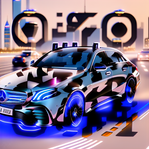
That’s where visual QR codes come in – codes that look like part of the design, not like an afterthought.

Good design has been proven again and again to increase:
- attention
- click-through
- engagement
- time on page
- conversions
Brand and design agencies share the same lesson over and over: when something looks unique, cohesive and visually pleasing, people interact with it more. It’s not magic. It’s how our brains work.
A visual QR code:
- breaks the pattern your brain normally ignores
- fits into the brand’s look and feel
- creates curiosity (“What is this cool graphic?”)
- feels intentional, not random
Suddenly, the QR code is no longer a barcode.
It’s a small piece of visual identity.
4. Why tools like QR Diffusion actually matter here
A few years back, if you wanted a nice-looking QR code, you needed a designer, time, and a lot of trial and error. One wrong move and the code stopped working.
Now?
You can generate visual, fully scannable QR codes in minutes.
On QR Diffusion (👉 qrdiffusion.com), you can:
- create QR codes that look like artwork
- match them to your brand colors and vibe
- experiment with different styles and moods
- keep them dynamic (change the link later)
- avoid all the manual Photoshop pain
It’s especially powerful for:
- cafés and restaurants (menus, table codes, loyalty)
- events and festivals (posters, tickets, wristbands)
- e-commerce packaging (unboxing flows, loyalty, upsell)
- influencers and merch drops (secret links, exclusives)
- real estate (listings, virtual tours)
- any brand that wants to look like it’s in 2025, not 2010
The equation is very simple:
Beautiful QR → people notice → and your business grows!
Boring QR → people ignore → nothing happens.
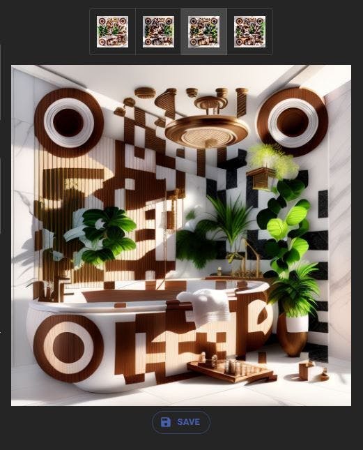
5. Where visual QR codes really shine
In cafés
Imagine a café where the QR on the table isn’t a black box, but a soft, pastel illustration that matches the interior. It feels like part of the place. People notice it. They’re curious. They scan.
On packaging
A stylized QR that’s integrated into the packaging design doesn’t feel like a technical element. It feels like an invitation:
- “Scan to see how this was made.”
- “Scan to unlock a secret discount.”
- “Scan to meet the maker.”
Suddenly, the QR is part of the unboxing moment.
On event posters
A big, creative QR in the middle of a festival poster becomes the hero, not the footnote. People take photos of it. They share it. They scan because it feels like a gateway, not like a legal disclaimer.
On merch
A QR woven directly into the graphic of a hoodie or T-shirt… now we’re talking. It looks interesting. People at a party or on the street will ask: “What happens if I scan this?”
And that’s the point:
Your QR becomes a conversation starter, not a blind spot.
In real estate
A minimal, modern QR on a property sign looks professional, fresh, high-tech. Someone sitting at a red light might actually grab their phone – just to see more.
6. What’s next for QR codes (2026 and beyond)
QR codes aren’t going away. They’re too useful for that.
But they are changing.
Expect to see:
- more visual-first QR codes instead of generic ones
- more AI-generated QR art used directly in branding
- more dynamic QR that can change destination over time
- more QR + AR experiences, not just boring links
- brands treating QR as design and identity, not just a utility layer
The brands that move early on this will look more modern, feel more premium – and, very pragmatically, get more scans.
Final thought: QR codes don’t need a replacement. They need personality.
People don’t ignore QR codes because the idea is bad.
They ignore them because they’ve all started to look the same.
The moment a QR code becomes visually unique – surprising, beautiful, aligned with the brand – people start noticing again. And once they notice, scanning is just one small step away.
If you want to stop your QR codes from behaving like urban pigeons and start acting like something people care about, you don’t need a new technology.
You just need a better design.
You can start here:
👉 qrdiffusion.com
Make a QR code that people actually want to scan.